Charts
Data Visualizations
Chart a project's own material. Open a project and choose Data Visualizations from the search box at the top, then ✨ New visualization.
Make a chart
- Under 1 · Data source, choose where the data comes from, then the item.
- Under 2 · Chart, pick a Type and choose which columns go where.
- Give it a Chart title and click Save, or Save & publish ▸.
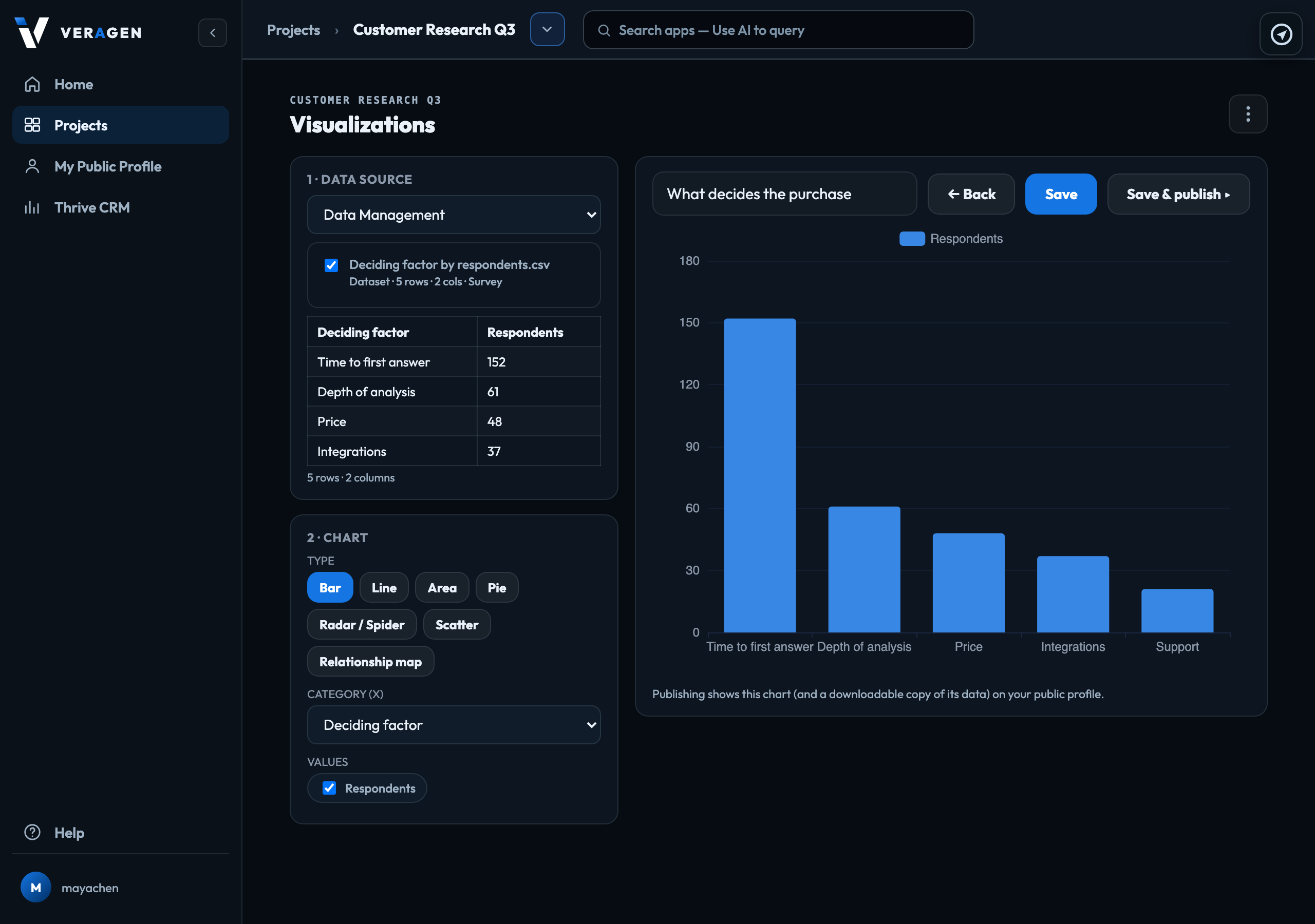
What you can chart
| Data Management | Any file with a table in it: a CSV or spreadsheet, or a document or page that contains a table. Tick several files to chart them together: they are combined on the columns they share, with a column naming the file each row came from, and any column they do not share is named on screen. |
|---|---|
| Persona Simulation | How many personas reached each outcome. |
| Crawl | What a crawl collected, item by item. |
Chart types
Bar, Line, Area, Pie, Radar / Spider, Scatter, and Relationship map for showing how items connect.
A chart keeps a copy of its data from when you saved it, up to 5,000 rows. It does not change when the file does: open the chart, pick the source again and save to refresh it.
Publishing
Publish (or Save & publish ▸) shows the chart on your public profile with a downloadable copy of its data. Publishing needs the owner, admin or publisher role.
Signed in to VeraGen? Press Guide me on any screen for a walkthrough, or ask Odin.